Features
Meetings
Retrospectives
Planning poker
Daily standups
Tools
AI-Assist
Metrics
Agility Cards
Integrations


 Pricing
Login
Get StartedStart
Pricing
Login
Get StartedStart
Retrospectives
Planning poker
Daily standups
Tools
AI-Assist
Metrics
Agility Cards
Integrations
Pricing
Login
Get StartedStart
COMPANY
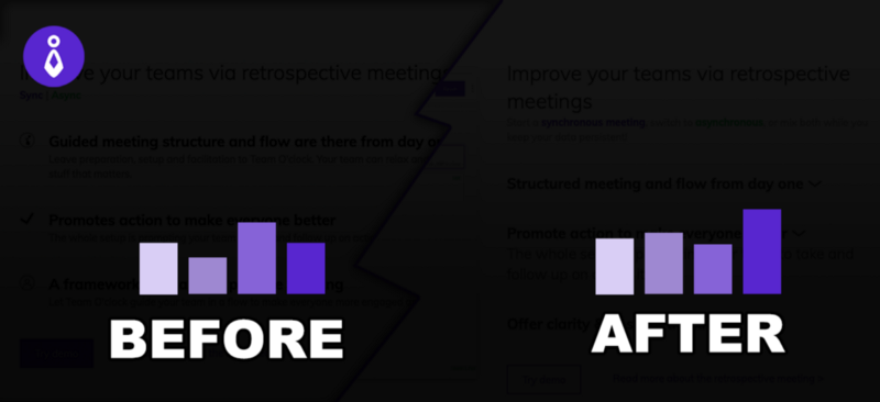

Homepage metrics, a BEFORE and AFTER case
In July 2021 we coordinated over a live stream in Youtube (content in Greek) with a great designer into improving the Team O’clock home page. In this post we’ll explore the metrics we’ve initially noticed, the changes applied, and the final metrics a month in with the new homepage.
If you’re in a hurry, this is a TL;DR version of the post that follows:
Running the live stream session helped us set some benchmark metrics on the Homepage performance related to experience. We proceeded to apply the suggested changes and measure the updated metrics, with August being an outlier, shifting measurement for the worse! Overall, this exercise had a positive effect on the metrics and we now have a bar to cross and compare on any future changes to come!
Keep on reading to get all the details!
Homepage BEFORE: The starting point
Team O’clock homepage was designed some five to six months ago, in the beginning of 2021. At that time we wanted to briefly promote all the major features of the service, and also include pricing and a set of free tools that Team O’clock is offering.
As a result, the homepage ended up being too long with a non-cohesive message to share. Checkout how the page used to be here.
The metrics we measured on the before state refer to June 2021 and are:
72.55% Bounce rate
, which is the percentage of visitors that abandon the Team O’clock domain right after visiting the specific page. A high bounce rate means that people either don’t understand the value offered by the service, or they are not interested.
51 seconds Average Time on Page
, which is the average time — in seconds or minutes — each person is staying on the page. A big number here means that people do a lot of reading, or trying to dig for the value through the content.
1.78 Average pages viewed after Homepage
, which shows how many more Team O’clock pages people visited right after the homepage. Visiting many pages means that people were intrigued by the content and stayed a bit more to explore it.
10.28% clicks for signup from the Homepage
, which is the percentage of visitors that were convinced to signup to the service after visiting the Homepage.
On top of the above we benchmarked the scroll intention of the visitors, how deep did they viewed the Homepage content, using heatmaps. The monitored behaviour was that a 30% of visitors scrolled through the first feature and a 5% scrolled to the bottom of the page.
Re-design session goals and direction
During our live Youtube session we concluded to a set of direction into improving the Homepage redesign. It’s worth noting how good that live session was, but will be sharing more on a dedicated post!
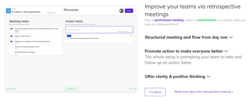
The redesigned version was live a short after our live session, and it stayed active for almost 2,5 months. As we changed our homepage design again, following are some screenshots of the updated homepage version.
Overall, we made the homepage more compact, with clear sections for the main features narrative, and breaks for the different narratives.
The main points of the redesign are:
Each feature promoted using accordions for more information per functionality and an accompanying image.
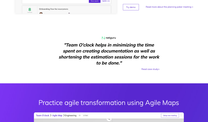
Different designs between main features (Retrospectives, Daily Standup, Planning poker) and complementary features (Agile Maps, Integrations)
Removed some secondary information sections, promoting a set of free tools, extensive CTAs for signing up, and a motivational quote section.
Pricing shifting to a dedicated page with an FAQ section.
Homepage AFTER: Measuring the impact
To see how the new page performed, we simply measured the same metrics 2,5 months in — period of August to October 8 2021. In a later post we will be sharing why and how we changed the Homepage again, specifically on October 8 🙂.
Here are the results:
63.05% Bounce rate, an improvement of 9% compared to the previous version.
37 seconds Average Time on Page, which is 18 seconds less than the previous version. This is kind of expected, as the Homepage content is now shorter.
1.8 Average pages viewed after Homepage, that is more or less exactly the same as the BEFORE state.
10.86% clicks for signup from the Homepage, with a slight gain from the 10.26% of the BEFORE state.
Based on the above data for the whole period that the updated Homepage was active show a small difference to the BEFORE state. The biggest benefit being on a 9% improvement on bounce rate.
Narrowing down the period from September to October 8, the narrative is quite different:
33.52% Bounce rate, almost half of the BEFORE version!
29 seconds Average Time on Page, being even lower than the whole period checked above!
1.824 Average pages viewed after Homepage, with a slight difference from the BEFORE state.
12.3% clicks for signup from the Homepage, a gain of 2% compared to the BEFORE state.
In regards to the Homepage heatmaps for September, we saw a decrease on scroll to the first feature by 5% — to 25%. The overall scroll to bottom rate increased by 2% — to 7%. Another important metric from this set of data is the clicks to visit the pricing page, that got a 10.28% of all clicks on the Homepage!
Reviewing the above data, we can say that August was drastically different from September in regards to visitors behavior. This might be due to seasonality and interest of people visiting Team O’clock homepage — during the summer of 2021.
Last thoughts and next steps
Performing these changes on our marketing page has been a great experience on shifting our focus to outcome. Measuring and comparing the impact of these changes is eye-opening!
Another point, is on the importance on setting the proper framing for our measurements. August has been an outlier in this report, especially considering the difference in percentages of the whole period (August and September) versus September only.
As a closing point, improving the top of the funnel in a service like Team O’clock is always a good thing! This exercise was a great excuse to set some metrics for monitoring. Also, the current measurement will act as a benchmark for all changes applied in the future.
The meeting facilitator
for your remote teams
Efficiency, collaboration, and speed
with AI-assisted retrospectives, daily standups, and planning poker meetings.